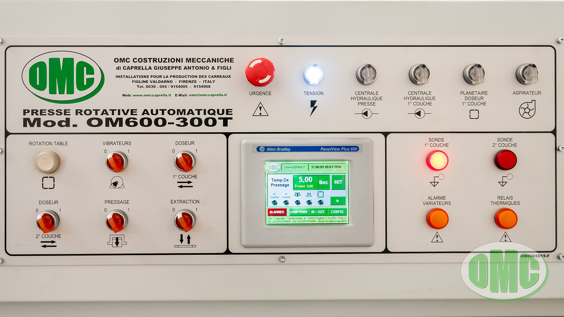
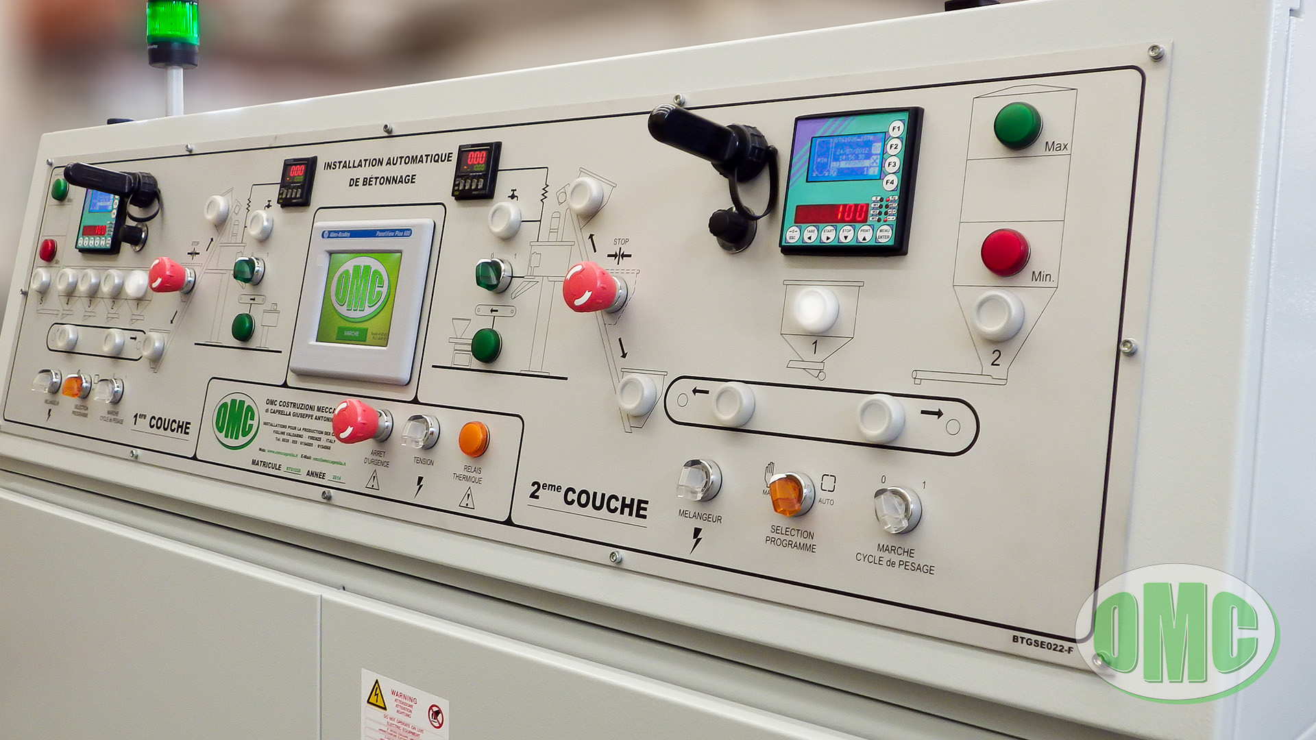
The design of a machine involves numerous fields of ingenuity and requires the study, analysis, construction and use of components and technologies that range from mechanics, to electronics, up to, of course, the analysis of human-machine interaction.
Precisely the HMI (Human-Machine Interface), also called User Interface (abbreviated as UI), is one of the key components (as well as critical) in the construction of a machine, since it determines its usability; a machine, however evolved or engineered, will never be efficient if its use is not simple, practical and fast.
The greater the complexity of the machinery, the better its usability must be.
The User Interface
By “User Interface” we mean the flow of information that allows the operator to decide and control the process to which they refer: a flow of information that is bi-directional, including both the information that the operator directs towards the process (e.g. pressing a button or entering a value via Touch-Screen) both the information that the operator receives from the process (e.g. an alarm message or an audible warning).
This information can be of various kinds and, therefore, can be grouped into various information systems:
- Ideograms and Texts: They represent or identify a function, a part of a process or a notice;
- Visual Information (non-textual): Generally conveyed through warning lights or screens;
- Sound Information:g. speakers or sirens;
- Control Actions: Managed through keyboards, buttons, switches.
The set of various machine information systems is defined as a Console or Control Station, also identified in the machinery also as a synoptic panel (from the Greek sunoptikós «seeing the whole together or at a glance»); multiple control stations can be grouped to manage and control different processes or machinery, thus creating a Control Room. Some parts of the control station can be delocalized with respect to the central system where the machinery or process requires it for specific needs (e.g. a multi-colored flashing light in an area from which the main control station is not easily visible or a button panel for remote control).
As anticipated, for human-machine interfaces the concepts of usability and accessibility are of primary importance to ensure what is generally defined a user-friendly machine, as well as to make sure that it is used in the intended way.
Regardless of the type of machinery designed (industrial, civil, medical, consumer products, etc.), an incorrect or inadequate design of the human-machine interface will discourage its use.
Evolution of the Human-Machine interface
Human-machine interaction has evolved over time, hand in hand with the technological development and evolution of the machines themselves; we went from the simple button/switch with light to Touch-Panel panels with the possibility of multi-touch management, SCADA, virtualized interfaces moved on mobile devices such as smartphones, up to the integration of augmented reality.
Today a typical Console of a machine provides a particularly large number of functions, contained in a single interface where commands and signals must be clearly arranged, as well as in easily accessible positions and such that their use is done intuitively and with limited probability of errors. Added to this is the need for the interfaces to be as uniform as possible, especially if the work process involves the use of multiple machines, so that the passage from one machine to another does not entail major differences in the control modes.
The engineer must constantly keep up with the technological evolution, at the same time trying to balance the use of new components and design elements with the creation of an interface that can adapt, as best as possible, to the intended use in the final work environment; a widespread error is to forcefully integrate advanced information systems, with the belief that they can represent a commercial advantage over the competitors. However, without adequate analysis and a deep understanding of how and where the machinery will be used and of the skill of operators, the result will be an interface that is not effective nor efficient. This means that the latest technological solutions available on the market are not always the best choices.
The ability to move the design perspective from that of an engineer to that of an end user is a fundamental skill in the design of an HMI.
When, then, the interface must be designed and built to be used on machinery (or in general, on applications) sold on the world market, used by operators of different languages and cultures (as well as with different degrees of education), the problem of making this interface understandable, usable and accessible becomes even more pressing; this involves, first of all, an important abstraction work to synthesize the description of the function, reducing it, where possible, to a symbol or a small text string.
In other words, the user interface must be simple to understand and easy to use from the first use, giving a minimal training to the operator.
Our approach
Our approach has always been to use new technologies to design and build simple and practical machinery, without, however, sacrificing the efficiency and performance of the machinery in any way.
Technological innovations are integrated by trying to make them as transparent as possible for the end user, following the concept “Easy does not mean Simple“. In other words, through a design a design that pays attention to the needs of the end user, we simplify the management of the machinery as much as possible, in order to allow the management of the production phases in the shortest possible time and with the possibility of intervening adequately in any situation.
The user interface for our Touch-Screens has been developed by designing a common base that makes it uniform and consistent from machinery to machinery, with the possibility for the operator to move from a Press to a Palletizer, finding similar commands, warnings and notice, simplifying their understanding and management.
Our control panels have anodized aluminum panels screen printed with symbols that are easy and immediate to understand and buttons and lights are not totally replaced by the Touch-Screen panels, so as to maintain the tactile feedback and the “certainty” of a selector or a button, with the possibility of continuing to manage the machinery (and to continue the production) even in case of a malfunction of the touch panel.
But, as said, “Easy does not mean Simple” and through the user interface it is possible to manage and customize numerous operating parameters of the machinery. And now there is the possibility of virtualizing the management of the machinery so as to allow both remote assistance by our technicians as well as “dematerialize” the control console, making it also available via the Web interface.


